Recommended Posts
Holozing Curation Compilation 329
2 comments
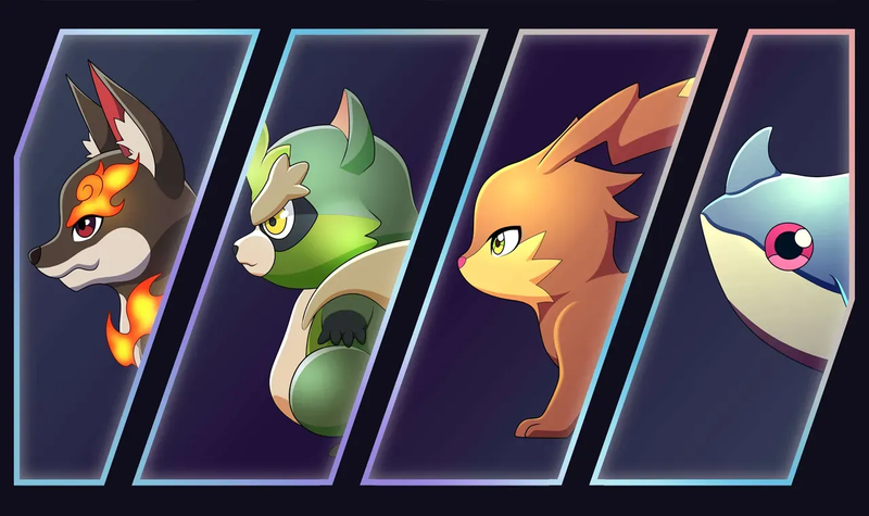
Holozing Curation Compilation #329
Welcome to this issue of Holozing Curation Compilation!
Hello everyone!
This is our curation effort that aims to curate posts that are shared in the Holozing community. These posts highlighted are the finest content that our Holozing curators submit for curation. We also encourage you to visit these blogs and show these great Holozingers your support and encouragement. Engagement is what makes the community thrive, so we hope that you are taking the time to visit each other's posts.

Author:
Curator:
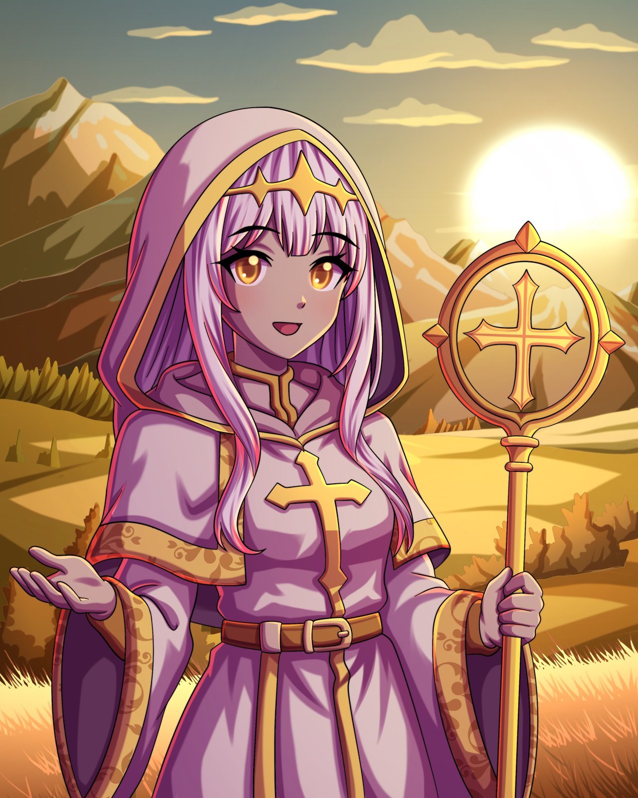
My creation started with a rough sketch to capture the character’s overall pose, energy, and proportions. I kept it loose and expressive, focusing on the warm personality I wanted her to radiate. It was important for me to convey a welcoming gesture and a calm presence right from the beginning. Once the sketch was ready, I moved on to the linework. This step is always like sculpting in ink—it’s where I define every detail. I paid close attention to the folds of the robe, the hair flow, and the symmetrical elements in the staff and the cross to maintain a strong sense of balance and harmony in the design. The coloring stage is where she began to shine. I chose a palette of soft lavenders, creams, and warm golds to reinforce her light-themed aesthetic. Each color was selected to work together in harmony, creating a gentle but divine look that stands out without overpowering the viewer. Next came the shadows. I applied them carefully to add depth and a sense of realism, especially around the fabric and hair. Light direction played a big role here, as I wanted the sunset in the background to cast a gentle, golden glow over her figure. Then I added highlights to enhance the magical atmosphere. Strategic touches of light on her eyes, staff, and robe edges gave her a luminous, holy aura. It helped her really pop out from the background and added a beautiful contrast with the shadow work.
Author:
Curator:
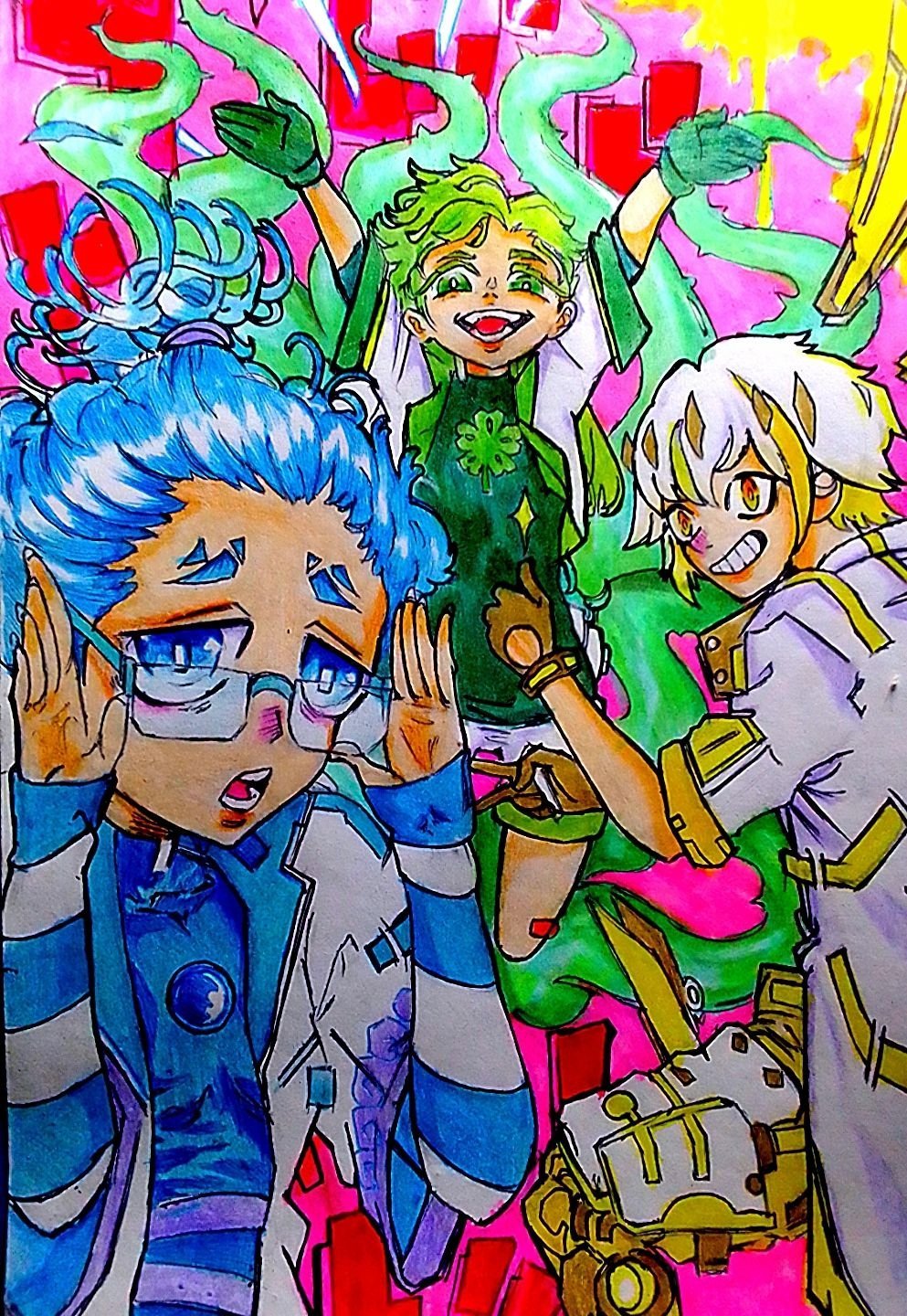
This is another magnificent fan art done by yours truly, me! Using different color style to create a new color theory on the artwork . I know there's a lot of room for improvement but it's always been fun for me everytime I make new art like the background, color values . Being an artist aren't easy..but am glad I am. To be completely honest it was challenging at the same time fun and I welcome the challenge, cause when thinking of the color value and the background I was going to use i wasn't very confident at first but am glad I was still able to complete it.i still really feel I could've done more but hey no regrets. First I used a 2B pencil for sketching the figure and pose of the character. Second I used a black ball pen for outline hence making the sketch clean. Third was to pick out the right color style to be used...
Author:
Curator:
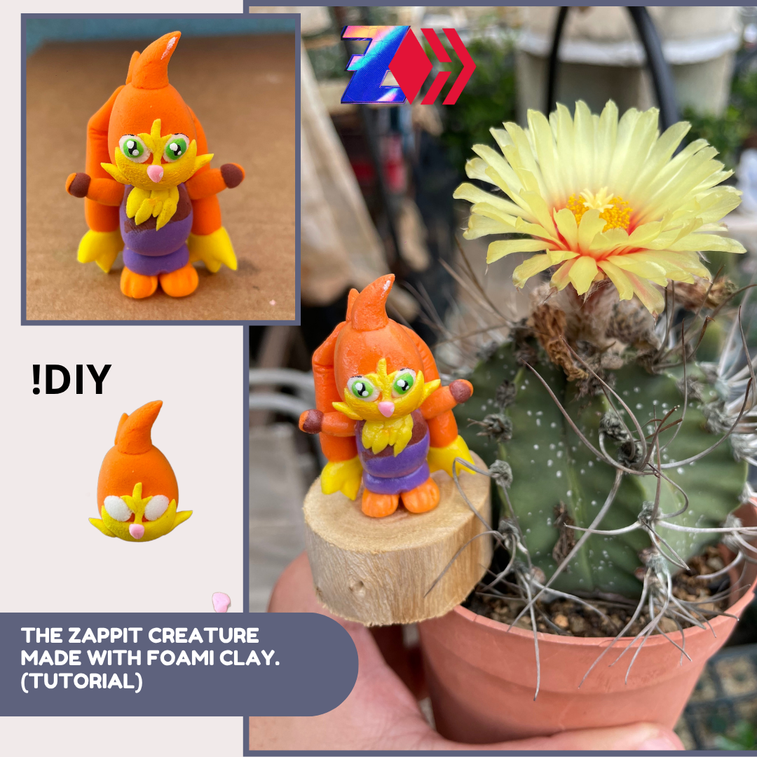
Today, I’ll show you how to make Zappit the Rabbit—one of the creatures from
—using moldable foam clay (foam clay). I hope you really like this creation, and I’m thrilled to share my experience working with this flexible material. Join me! Next I will show you step by step the realization of my work. In the initial phase, I start by taking a portion of clay in orange color for the development of the body. Then, with his hands he molded them into a ball shape, giving them a curious finish. Next, I’ll work on the rabbit’s movement parts—its legs, belly, ears, and arms—using new shades of violet, brown, and yellow. As always, I’ll give it my very best! Finally, we’ll craft the eyes and add the finishing touches to the face and ears, using green, black, and white for highlights. Then, we’ll apply a coat of acrylic clay varnish to give it a unique polished look. This design is a bit more complex due to the smaller, detailed parts that require careful molding. It should be noted that this design was sought in the Holozing community; but the realization are made by me, with dedication to...
Author:
Curator:
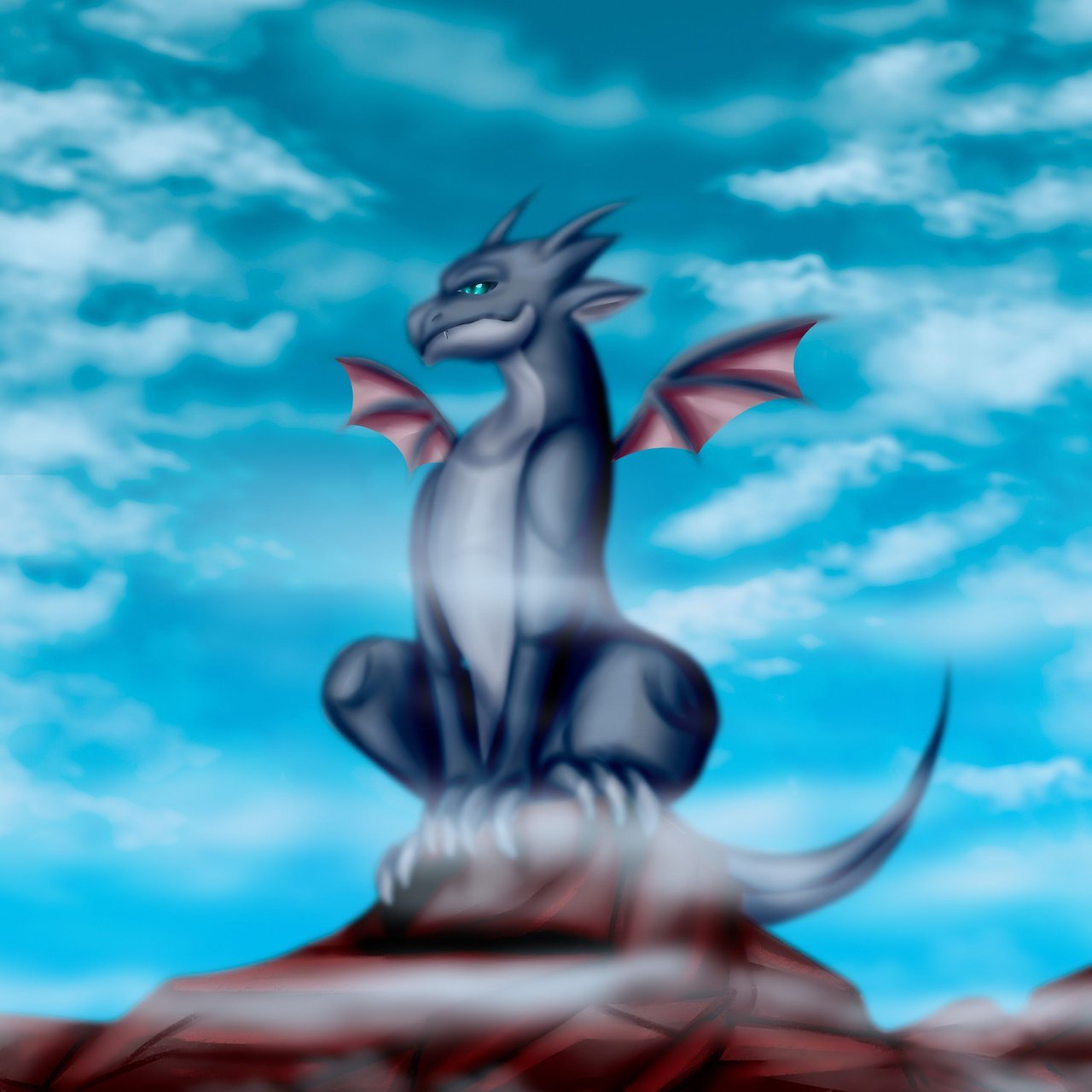
Today, I'm here to bring you my most recent work which I finished just last night, and as in 1 hour I have to go to take a class I am doing, I did not know if I would have time to share it with you during the day, so I preferred to do it right now. The artwork is an illustration inspired by the
game, in this case in the dragon creatures of the game, previously I have done some illustrations of the elemental dragons such as the Ice type dragon and fire type dragon in their evolved versions, and this time I wanted to focus on the basic dragon (DRAZING); although this dragon does not have an evolved form because I decided to illustrate it with a more adult appearance, much larger, more serious expression on his face and of course with a style focused on Semi realism which is my style of illustration. The first thing I do in all my drawings and works is to build a basic skeleton of the character, animal, creature or whatever I am going to illustrate, in this case I drew the dragon (DRAZING) perched on the edge of a large rock, right on top of a huge mountain, in this case I wanted to adjust a little the body structure of the dragon and stretch a little more his arms, neck and torso to suit my style. Once I had managed to capture my idea in the sketch the next thing I did was to go to my color palette to choose the shades that would give life to my work, I started with a base of intermediate gray colors to give the basic shape to the body of the creature, at this stage I like to use the airbrush brush to give shape to the arms, legs and a little to the skull of the dragon in a softer way. In the 2nd stage of the process I used lighter tones, with a not so pure white color I textured a little from the jaw of the dragon, passing through the chest and up to the tail, then with reddish tones I gave a little warmth to the ears of the creature; later with the same tones that I used for the ears I built the wings on the back of the dragon, in this case I decided to make it not very big to maintain the basic essence...
Author:
Curator:
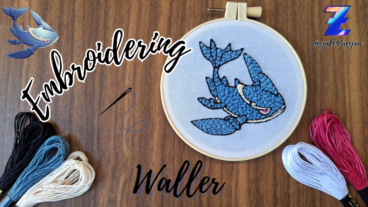
I'm back here to show you my new fanart, this time dedicated to Waller, the evolution of Water Whale. This whale looks like a warrior to me, unlike Whale, who seems more tender in terms of physical appearance. A few months ago I embroidered Whale; it was my first Holozing character embroidery. I chose her because I thought it was the easiest to start all these fanarts with. Today I'm showing you her evolution, which I also found easy, since it has few colors and they're all the same. Luckily for me, I had skeins of these shades left, so I didn't have any trouble. I did it in just one afternoon while watching my Turkish soap operas 😄. I hope you like it. Below, I'll show you all the necessary materials and the step-by-step creative process. To begin, as always, I draw the character on a sheet of paper, as it's much easier to transfer it to the fabric with carbon paper than to draw it directly on the fabric, as there's a risk of ruining the fabric if we make a mistake. For this reason, I always do it this way, as it's one of the best techniques I know for transferring and getting good results. When I'm finished, I go over all the lines with a pen for better visibility and then place the fabric stretched tightly on the frame. I began embroidering with the black thread. I used this to create the entire silhouette of the character, outlining all of its parts. Otherwise, since it's almost entirely the same color, the fins wouldn't be visible. To do this, I used the finest magic needle, so I only used three strands of thread, so I would get thinner lines...
Author:
Curator:
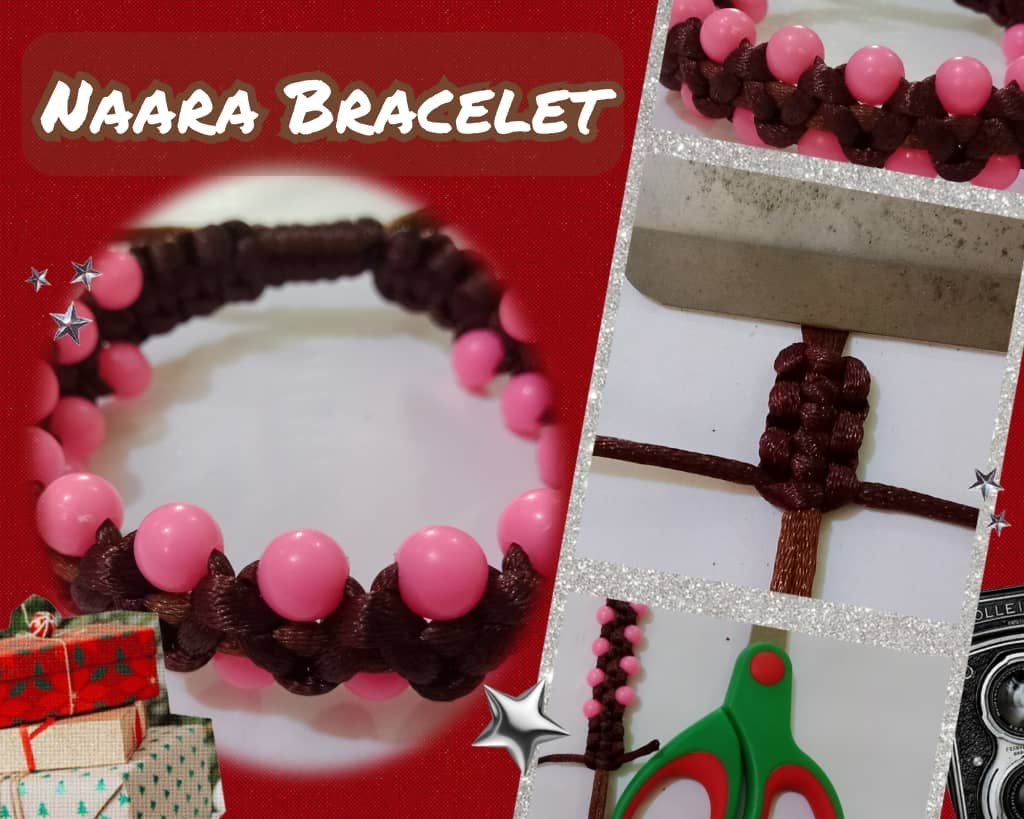
This time I share with you a fan art inspired by one of the characters known as Naara. My fan art is a creeper style bracelet with colorful threads and pearls alluding to the character that highlight and provide an elegant style. With no more time to waste I invite you to join me in this fascinating creation and put your hands to the thread. The materials I used to make this beautiful bracelet are as follows, namely: Snakeskin thread, Scissors, Lighter, Tape measure, Adhesive tape, Plastic beads. To begin this beautiful jewelry I started by cutting two 40cm strands of thread which I will use as the base for our bracelet. Then I cut a 130cm strand of yarn that I will use to make the vine style weaving. Started the bracelet by making flat knots in the following way: First I took the right strand, passed it over the base, made a P shape, then took the left strand, passed it over the right strand (which was on the left side), then passed it over the base and pulled it through the inside of the right strand (the P shape). Then I stretched the thread on each side evenly to make the knot. With your fingers you press it so that it is even on both sides and so we begin our weaving. Now I took the thread on the left side and passed it over the base thread, I formed a kind of four, then I passed the thread on the right side over the left thread that we have on the right side, then I passed it under the base thread and took it out through the inside or ring of the left thread as shown in the image. Then I pressed with my fingers so that both sides have similarity...
Author:
Curator:
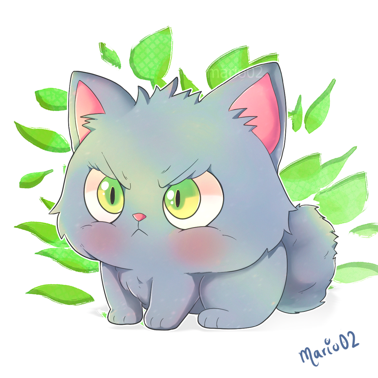
For this occasion I chose to represent the beloved Miu, the little cat that is the image of our friend
. He is one of my favorite characters, because of his simplicity and tenderness, despite having a slightly angry expression. For this illustration I chose to continue with my kawaii style, trying to keep the character's charisma, which I consider to be in his eyes. As a background, I used some leaves to help highlight his eyes and create a good contrast. I hope you like this version and without further ado, I leave you with my process below...
Author:
Curator:
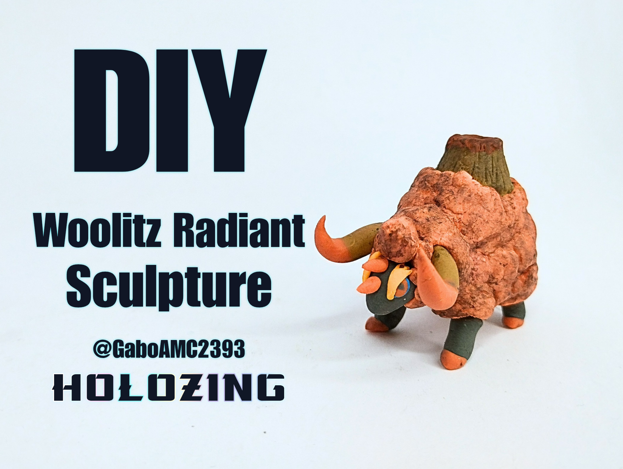
The other day I was making a Woolio Radiant figurine. Well, I was thinking about making his evolution Woolitz in Radiant as well. Although it would have been great the idea of making Woolitz simply an electric type but with another color, I thought that this Radiant mode could also be used to make a Woolitz of another element, since the premise of the post where Woolio was presented is that this is a normal type that evolves into a different type. Well, thinking that Woolio could evolve in a mode other than electric in its Radiant mode, I made a Woolitz but of Magma or fire type, as you prefer to call it. So, I present to you my Woolitz design but of a different elemental type. As you can see, it is the same Woolitz but with certain different elements, such as the color, the nomenclature of the small horns and of course, the most striking, a small volcano on the back. To start making this figurine I used a deep orange plasticine, which I mixed with a little gray to give a little opacity. After having the desired color, I made several small plasticine spheres, as you can see in the image below. I made all the little spheres in different sizes, big and small, and then I stacked them all in a handful, in different positions and places, as you can see in the image below. Later, with a stiff brush, I made numerous little dots to give it that cloud look. After defining the shape of the body, I made the head and placed the different types of horns. In the image below you can see that the eyes are a deep red color, the eyebrows are yellow and the horns are brown and the tip is red...
Author:
Curator:
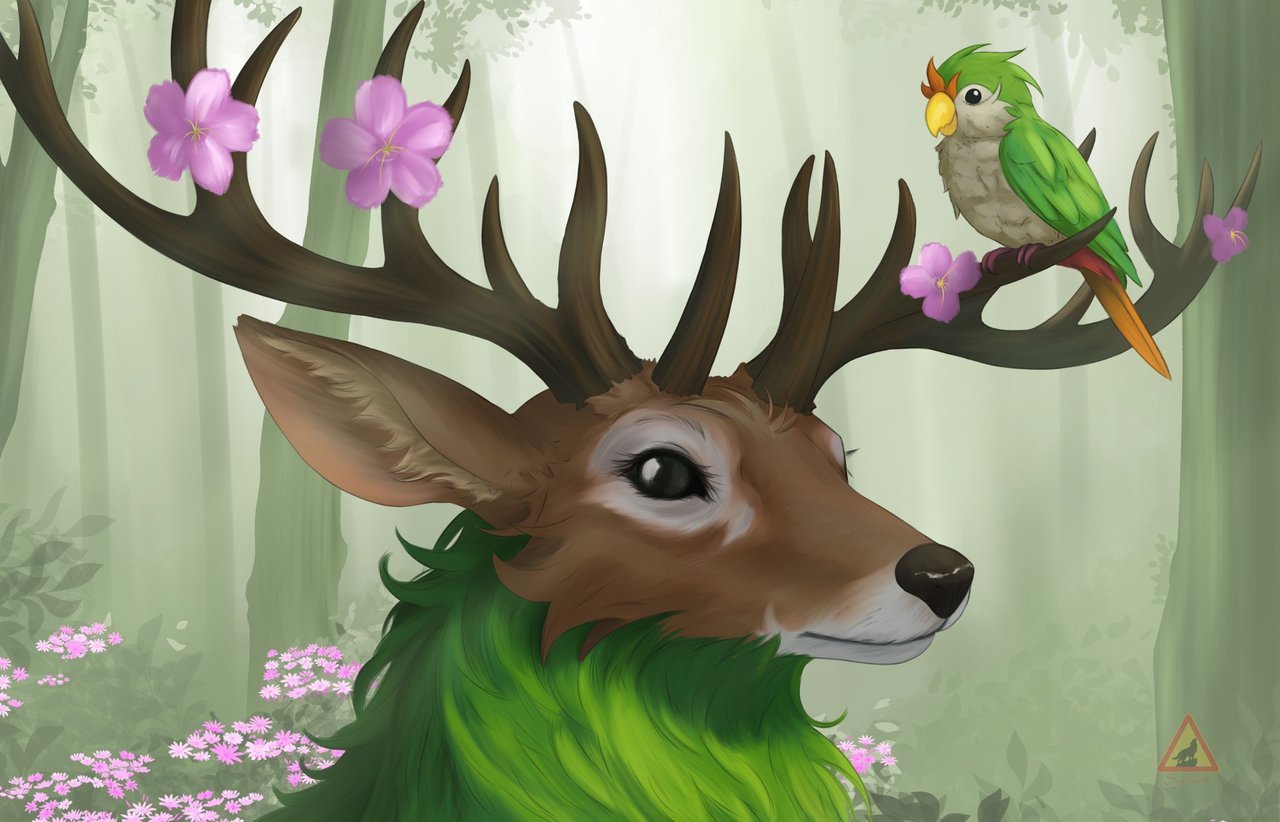
I was practicing a somewhat different style of painting for my new Wallpaper " yes that's why the size of the image is different from the format we always upload". I could say that this was an experiment which I was about to abandon in several occasions of the creative process haha but there is always learning. About why I wanted to make a new wallpaper, well I'm still using the Halloween drawing I made of ocean healer last year, it's time to change it, isn't it? I mean we are in July haha. well join me to see this step by step. Honestly, I enjoyed the creation of the sketch and lineart.... I wanted to add several Chirple on the antlers but I feel I was already a bit short of space, the reduced size of the antlers is intentional because I feel that if I put them real size I would have to move the face away and I didn't want to do that. I used the same lineart brush I use for the manga, that little texture it has I really liked, but I'm not sure if I can apply it to the human characters. We apply the base color, here I had the first challenges I wanted to use basically a copy with the eyedropper of the color of the reference but that palette although it is very nice did not fit the idea of what I wanted to do so I had to experiment with various shades and get a medium tone between the reference and a lighter tone like the last time I did this character. We begin to give details for the background, although it looks a little simple it has several layers and very similar tones. with that we achieve the effect of those distant trees, following the rule of the greater the distance the color should be lighter the closer the darker the tone. I swear I had another brush for the leaves but after so much searching I didn't get it so I used this one you see. it wasn't what I wanted at the beginning but it looks...
Author:
Curator:
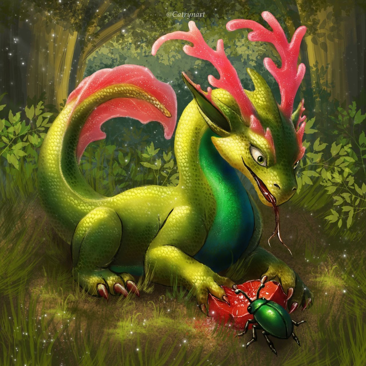
Today I stop by with a happy heart, because I want to share with you a new illustration with which I wanted to continue telling a cute story, a scene with the little dragon Verdarox and his inseparable little friend, the beetle. Both share a juicy fruit under the enchanted light of the forest, and this moment became for me a space of calm and visual narrative. I hope you like it very much. I started drawing the sketch where Verdarox and the beetle were together. I wanted them both to be very close, sharing a moment without distractions. I focused on their gestures, not only for the fruit, but for their expression. I concentrated on the green tones of the dragon and his little friend. I colored the beetle with various shades of green, some cooler and others warmer and brighter, to differentiate it visually but maintain the harmony of the whole. I used soft brushes for the general shadows, but added small touches with more textured brushes for reflections and the beetle's shell. The light filtering through the forest I treated it as a silent protagonist defining the environment without being too intense. For Verdarox I worked layer by layer, using textured brushes that simulate sub
Comments