Customizing Box Plot Panel Background - ggplot Tutorial 10
0 comments
Hey everyone, and welcome back to the final tutorial in the series on customizing box plots using the R programming language. So far we have learned how to create a basic box plot, adjust the box plot itself, and add custom labels. In today's video we're going to be finishing up by showing you how to change the background appearance of the box plots by using the theme() command.
Getting Started
As with all of the tutorials, we will start off by creating a basic box plot using the following code.
library(tidyverse)

mtcars$cyl <- as.factor(mtcars$cyl)

ggplot(data = mtcars, aes(x = mpg, y = cyl))+
  geom_boxplot(show.legend = TRUE)
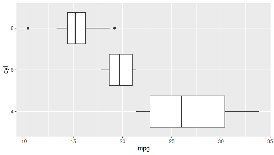
This code will create a basic plot that looks something like this.
Customizing
Now that we have our basic box plot set up, we can go ahead and start customizing things. I think the easiest way for me to demonstrate this is to provide some sample code first, and then highlight what each of the different elements is doing.
ggplot(data = mtcars, aes(x = mpg, y = cyl))+
  geom_boxplot(color = "orange", fill = "orange")+
  theme(
    plot.background = element_rect(fill = "black"),
    panel.background = element_rect(fill = "black", color ="hotpink"),
    axis.text.x = element_text(color = "blue"),
    axis.text.y = element_text(color = "blue"),
    axis.title.x = element_text(color = "blue"),
    axis.title.y = element_text(color = "blue"),
    plot.title = element_text(color = "blue", hjust = .5),
    panel.grid = element_line(color = "purple")
  )+labs(
    title = "Title"
  )
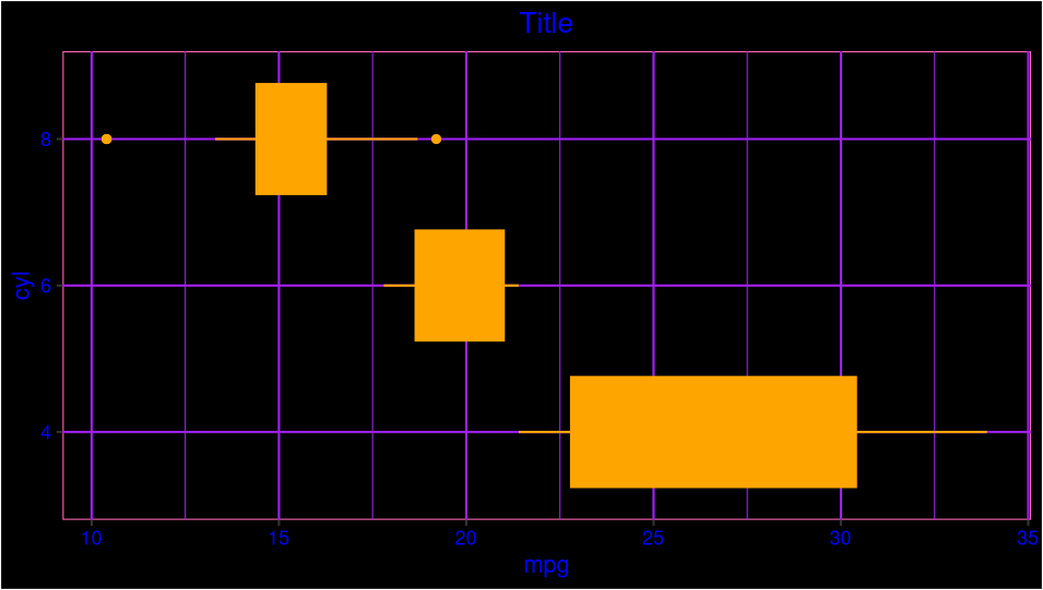
Once we run the following code, it will produce a plot that looks like this. Obviously, this is NOT the proper color scheme to use for any kind of professional presentation, so feel free to replace the colors in parentheses with something more aesthetically cohesive.
Explanation
Trying to explain all of the code in an essay-style format could get a little bit confusing, so I'd recommend checking out the provided video for further clarification. However, there are a couple key points to keep in mind. The first is the difference between the plot background and the panel background. The plot background is the overall background that is outside of the grid lines. By contrast the panel background is the area inside the chart where you see all the purple grid lines.
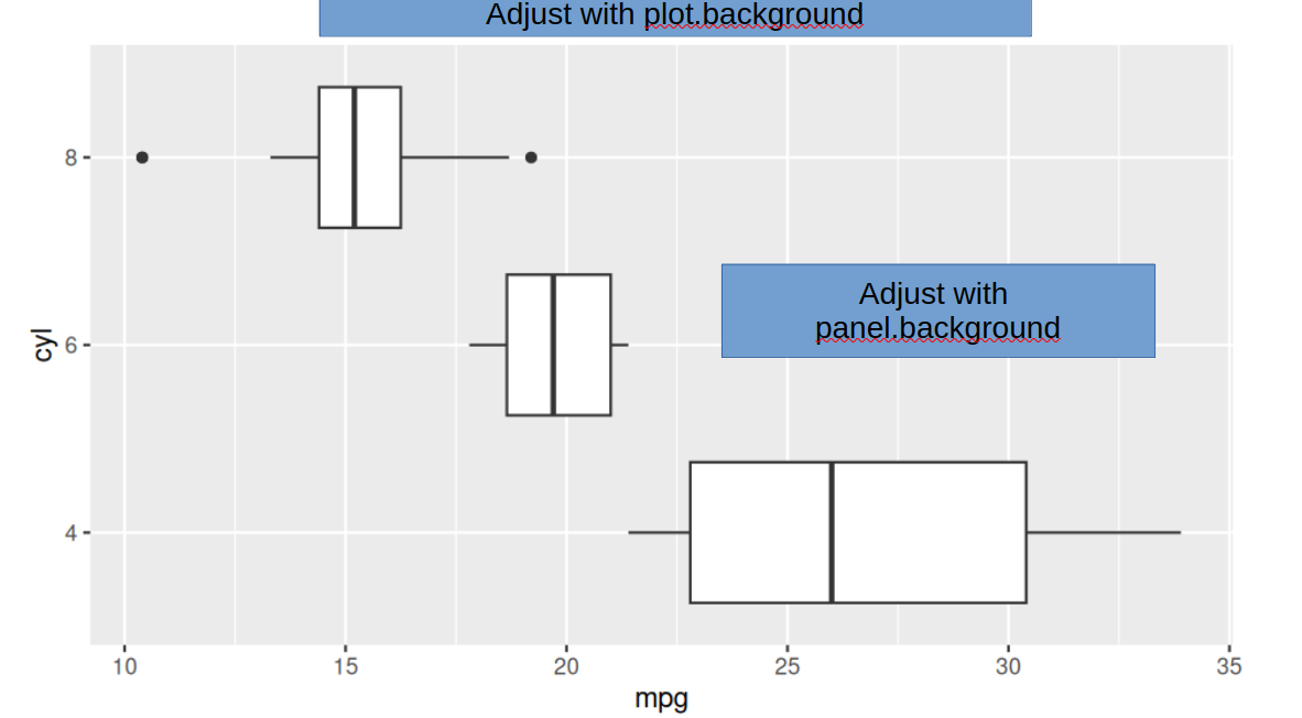
Finally, it's important to understand the difference between fill and color. Fill changes the entire background element, whereas color adjusts the border. For example, our panel.background element includes the fill color of black, but a color of pink. This leads to the area inside of the plot being colored black, but the hot pink border.
Summary
Over the past four tutorials, we have learned a lot about how to customize box plots in the R programming language. Obviously, the sky is the limit when it comes to customizing and there is so much more to learn. Nevertheless, I hope this tutorial has provided a brief introduction to some of the most commonly used customization features of box plots in the R programming language. As always, thank you so much for taking the time to read my article and I hope you enjoy the rest of your day.


Comments